Wednesday, 3 April 2013

Shipping Container Architecture- Krissy Andrews

To further my research I want to explore sustainable and eco friendly buildings that are aesthetically pleasing, contemporary architecture. After discovering a site called web urbanist I found a post that included 10 architectural creations using cargo containers. There are huge amounts of discarded cargo containers taking up space upon docks all around the world. The primary reason for this is because it is cheaper to buy new containers than to ship empty containers back, so why not put these discarded containers to use?

Here are several examples of modern container architecture:

'Shipping container architecture' has been around for a number of years, but the first two story (or two container) house was designed by Peter DeMaria in 2006. He has designed many more incredible designs since then that can be found on his website here. His experimentation in transforming such a mundane object to an exceptional example of architecture fascinates me and leads me to further research on creative high-end furniture designs. The paradox of using such discarded and unwanted goods to create a designer home intrigues me and leads me to explore other eco-friendly objects that could be useful in contemporary architecture.


Peter DeMaria's Home

Clive Wilkinson is a South African architect and interior designer well known for his award-winning office design for Palotta Teamworks ( I suggest you watch this youtube clip here for a tour around his designs).  Many large companies are looking for a greener alternative when designing their head offices due to the recession, making shipping containers an affordable option for as little as $900 each. Their strength, durability and availability make them a perfect object for large corporate businesses,  and their geometric and airy aesthetic design is a definite attraction.


Palotta Teamworks

Peieter Peerlings and Silvia Mertens: The designers behind the four-story Sculpt(IT) ultimate living space. This slick and contemporary design is a replica of the container architecture faze. Mirroring the dimensions and airy design of a container it is built between two existing walls separated by four wooden floors. Perhaps a better form of material than the opposing containers? Two glass blocks are located at each end of the structure, creating a very exposed and transparent area, "Where is the border of living if everything is visible?" They did in fact have a reason for creating such a transparent space, a witty stab at the "former trade" in the neighborhood: Prostitution.


Sculpt(IT)

I wondered while researching this topic if this emerging trend starting as an eco-friendly way of designing offices and spaces, will inspire designers to find even more affordable and easier ways of portraying this popular trend in harsh economic times rather than designers taking this trend into the corporate and expensive real estate market?

For more images on container architecture such as the Eco-Pod and Port-A-Batch visit here 


Sources: 
Renaissanceronin
DeMaria Design
Real Estate
Web Urbanist
Design Crave
Archinect

Date found: 2 April 2013

Designers: 
Peter DeMaria
Clive Wilkinson
Pieter Peerlings
Silvia Mertens

Tuesday, 2 April 2013

Integration Across Artistic Elements-Momo Xie


After reading about Joseph Churchward. I was particularly interested in his use of both manual and digital design and that drawing can contribute to a work. It enhances originality and creative control. This is AlePaul is work. He is from Argentina. He mostly focuses on script typography. This is calligraphic ornaments made by Ale Paul. It is a beautiful work which must of taken him a long time and I think this kind of calligraphy or lettering is always hard to implement technologically, even going back centuries. I also like the way he uses this type in film.It is good contrast and integration between moving image type and music. It is a wealth of swashes and flourishes with hundreds of calligraphic ornaments.  The movie is a peom. The font he was used matches very well because the music is very elegant just like the font it also flows well. The text overlapping the images is very harmonious.


Buddhist Temple- Krissy Andrews


After listening to the podcast in class i was fascinated by the 'old fashioned' approach Joseph Churchward still practiced when creating his typefaces. The superior designs did not look anything less than computer generated, and this started my initial research about the construction of design, or rather the more fascinating deconstruction of forms.

I wanted to steer the direction of my research into the construction/ deconstruction within sculpture and while doing this came across a fascinating act of recycling and art combined to create a truly remarkable Buddhist temple. The Wat Pa Maha Chedi Kaew Temple situated in the north-east of Thailand has been made from more than one million donated glass beer bottles, from Heineken and Chang beer. It has taken over 25 years to collect enough bottles to build this temple. Not only is the exterior and structure primarily made out of these bottles, but so is every single aspect of the temple's interior.  The bottles do not only create an eco-friendly building and tourist attraction but they also don’t fade over time and allow light to reflect around the temple.

This act of recycling is a refreshing approach to cleaning up our 'disposable' lifestyles, and a strong representation of what hard work, determination and creativity can achieve. I find this project and the process that Joseph Churchward undergoes when creating his typefaces very similar, as they both started with a very simplistic idea and was able to transform it into a work of art.


Date found: 1April 2013


Embracing the Digital Revolution- Laura Barge


When listening to the Joseph Churchward podcast, I was particularly interested in Churchward’s thoughts on hand-drawn type design and his apparent disregard for digitally generated type.
Although the digital revolution occurred throughout the 1980’s, during Churchward’s career, he chose not to embrace it.

This led me to start my paper-based research on the digital revolution; it’s effect on designers and the resistance it caused for many designers of the era. One of the few who did embrace the digital revolution however, was Dutch type and graphic designer, Rudy Vanderlans, who co-created the magazine Émigré with wife Zuzana Licko in 1984. Émigré took advantage of the new medium provided by Apple Macintosh computers to design digital typefaces.

Émigré cover, Issue 1

I found an interesting article of an interview with Rudy Vanderlans (here), who talks about the digital era, its effect on graphic and particularly type design, and the effect that globalization has had on the design culture we were once able to call homogenous.

““Everybody can see what everybody is doing, and subsequently there’s a lot of cross pollination going on, a blurring of boundaries.”

"Program" designed by Zuzana Licko in 2013

Something that stood out to me was Vanderlans’ comments on the digital revolution and new technologies within the design world:

“Whenever new technologies are introduced, the designer’s first reaction is to say, ‘it’s too crude, I won’t touch it. I’ll wait until it does what I’m used to doing.’ This is what happened when the Macintosh was introduced. Meanwhile, culture as a whole embraces new technology and is not going to wait for graphic designers to get their act together.”


What I learned from this interview and the research I have done surrounding it, is that as designers we have to learn to embrace change and new technologies.. If we do not, we run the risk of being left behind!!

Designers involved:

Rudy Vanderlans
Zuzan Licko

Link to interview discussed:


Retrieved 2 April 2013

Post by Laura Barge

Hyper-Photographic Realism - Jason Richards

Kim Aram (Blink magazine, Oct 2012): "Dean West"
Designers: Dean West & Nathan Sawaya

Dean West, 2012. In pieces [photographic series]

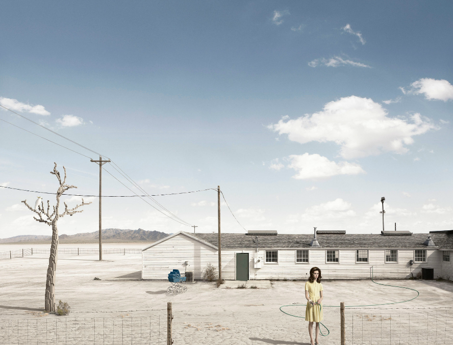
What I took away from the Joseph Churchward podcast is how much we rely on digital technology and how that in turn is influencing design itself. I was particularly interested in the references to digital pixelisation in the collaborative series "In Pieces" by photographer Dean West and LEGO sculptor Nathan Sawaya. The wide angles evoke a sense of isolation for the models, a mood and theme which is perhaps reinforced by the out of place LEGO constructions which are subtly introduced throughout the series. To me, there is a beautiful irony in working so hard to seamlessly integrate a digital phony into a scene whilst at the same time shooting it under the same lighting and conditions so it blends in realistically. It makes me question the process, and what other elements may possibly be fooling us in this work, and others. Something interesting to look into could be "photographic trickery".

Nathan Sawaya, 2012. Umbrella [lego construction]

Dean West, 2012. In pieces [photographic series]

Monday, 1 April 2013

Controversy and the New Zealand Moko - Melanie Firebrace

Jean Paul Gaultier's Fashion 2007
A piece of my paper-based research explores cultural appropriation and the koru, particularly in fashion.  It refers to Jean-Paul Gaultier's Spring/Summer 2000 line and while looking for some images I found a few interesting articles on the Gaultier's use of the moko in his 2007 collection.  They're a little off the topic of graphic design but I thought I'd post them anyway.  The issue of non-Maori appropriating traditional designs without understanding them, or giving them proper respect translates to other design disciplines:

Cheeky French steal moko
Controversy and the New Zealand Moko

Exotique Typeface and Cultural Appropriation - Melanie Firebrace

Barrett, M. (2009, Aug/Sep). K is for Kris... ProDesign (102), pp. 102-103.  Retrieved March 25, 2013, from ProDesign: http://prodesign.co.nz/k-is-for-kris-augsept-cover-story/2009/09/23/

My initial research from the radio broadcast focused on cultural appropriation in design, that is, “taking – from a culture that is not one’s own – of intellectual property, cultural expressions or artifacts, history, and ways of knowledge”. I wanted to move from more theoretical based readings to examples of New Zealand design which appropriate indigenous cultural expressions. An obvious example is the koru (curvilinear line punctuated with a circular stoppage), which is prolific in New Zealand art and design (e.g. Air NZ) as a symbol of bi-cultural national identity. However, the translation of the koru from its original purpose is not without controversy e.g. Dick Frizzell, Grocer with Moko 1992.

Looking for suitable graphic design examples, the first one which caught my eye was the bold cover image of issue 102 of Pro Design. It uses the “K” from PLINC Exotique typeface (See House Industries or Photo Lettering), coloured red and black. This image is taken from an Australian Graphic Design Association (AGDA) poster adverting the International Speaker Tour of Kris Sowersby (founder of NZ Klim Type Foundry) and designed by The International Office. The front of the poster uses an extremely large “K” with information on the event in the top left corner in small text. The asymmetry and contrast in scale is effective and dramatic, and the hierarchy works with with the use of black and red in the small text. On the reverse, the Australian cities are listed in the Exotique typeface with additional information in a small, plainer font.

I like the geometric quality of the Exotique typeface - the way in which it has two layers, and is two-tone. The line and circular stop form immediately suggests the koru and New Zealand, which is emphasised with the colour choice in the poster. I’m reminded of Gordon Walters modernist abstract paintings. As the designer Duncan Forces said “Australian typographers would have gotten a kick out of seeing such definitely Australian names treated in such as an obviously Kiwi style”.

What is interesting is that although the typeface was digitised by Kris Sowersby he didn’t design it. It was designed pre-1971 and according to Sowersby (see comment on ProDesign website) the “koru' like association is purely coincidental”. I think the name of the typeface probably suggests there was an influence from Maori or Pacific design but I can’t find further information.  I'd like to investigate typefaces which represent or suggest a national identity or local culture, and how this is conveyed in the font's structural elements.