From my previous research on ‘Illustration
Typography’ my searches lead me to onto other tangents. One of the things my previous
research led me to was Object Typography. I came across this blog ’41 creative alphabets.’ The Blog has a
collection of different typefaces created using objects. It has a range of
different creations from a variety of sources around the world. The blog
includes letters created from things such as, flowers, rubber bands, birds eye
views of cities, clothes even a mini-pocket tool. All are quite inventive and
much more unique then the regular computer generated type. It is hard to create
something today as a Graphic Designer that hasn’t been done before in some
shape or form. I think that even just using an object as a basis to draw
inspiration from when creating the form of a new typeface will give it some
individuality.
 |
| Origami Alphabet Emma Downing |
This
is one of my favourite creations from the blog. It’s an alphabet created by
Emma Downing from Origami paper folding. The artist used A4 sheets of card and
folding them to create the forms of each individual letter. Once the basic
shapes were worked out Downing’s process speeds up.
Working
in this manner would be quite different to how typographers normally develop
their fonts. They develop their fonts to maintain a continuity through-out, where
they group letters together such as, bcdepq and mnru, which include some of the
same forms. They work off the same basic forms through out to create a much
more unified typeface. Using an object to create your letters will restrict you
from using those conventional techniques, however even though the artist was
unable to do this the typeface still maintains a continuity about it with it’s
geometric, angular forms, restriction of round edges and folded corners. Following
her creation she has produced to book to teach people how to make these letters
themselves.
 |
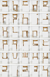
| Take a seat and say something Amandine Alessandra |
This
is another series from the blog that caught my attention. Mainly because I made
a typeface inspired by the form of a chair before. However even though they
have used the form of the chair to create it as well both typefaces are still
quite different. This font however is not as cohesive or readable as the
previous font, but it is more inventive.
This
typeface is created from a series of images of a chair where Amandine
Alessandra has revealed and concealed parts of the chair. It’s interesting
because when looking at it now you can tell it is the alphabet. However if you
were to look at one of these images on it’s own you would see it as a
meaningless installation. You would need to put the letters together to make
words to by understandable.
These
aren’t the kind of typefaces you could use like the standard typefaces you are
given to use in Microsoft Word. They are unique and are to be seen as an art
piece and to be appreciated on it’s own. So either just showed as an alphabetic
series to appreciate it for it’s visual qualities. Or to improve a concept,
with and object in the design of the letter it could enhance the meaning of a
word even further and used in a poster or even just in a title.
Sources:
Artists:
Amandine Alessandra
Emma Downing

Like your research, and i think this really help for our new typography assignment. and those website is worth to look.:)
ReplyDelete-Livia
This comment has been removed by the author.
ReplyDeleteYour research is impressed me alot:) I love all the works you researched.I am quite into hand drawn or hand made typography.That is amazing way when illustration idea combine with typography. I remembered one of your work from last year it's quite similar to this idea:) and I love your research pretty much:)
ReplyDeleteStephie Chen
Some typefaces if they say "dog" they should "Bark" :))) -Massimo Vignelli. Yknow?...
ReplyDelete-comment from chris
DeleteI've always thought this type of typography was really exciting!
ReplyDeleteI love the Origami Alphabet work right at the top, it reminds me a little bit of your mixed media workshop from last year, with all the folds and the bold colours.
I wish we had a project this year that focuses on object typography, that would be fun. And it would be really interesting to see what people would come up with since there are so many things in the world that we could apply it to.